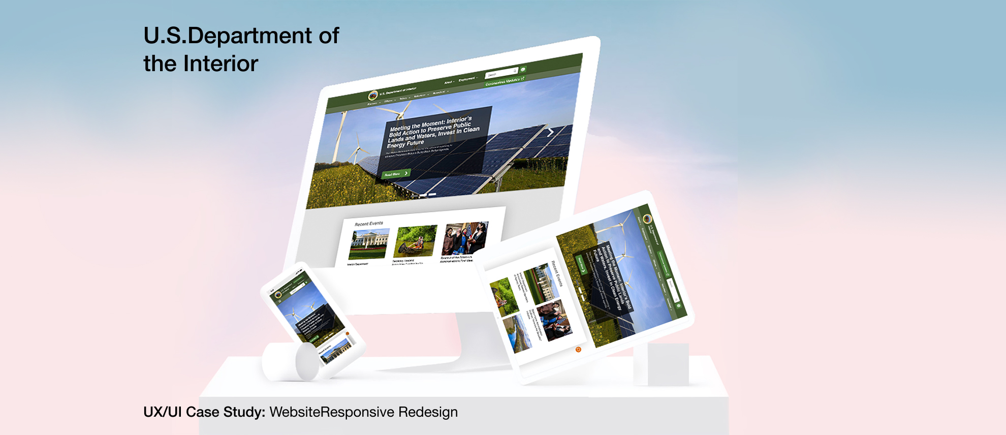
hreo

What is the U.S.Department of the Interior's mission?

The Department of the Interior (DOI) conserves and manages America’s natural resources and cultural heritage for the benefit of the people. DOI consists of 11 Bureaus and various programs & administrative offices.

How might we provide a UI that offers clearly visible functionality, makes clear the role of governing agencies, and offers more direct access to public lands, resources, and opportunities?

You can click here to check the Digital interactive prototype.
Project Overview
doi-poverview
doi-dgoal
UX Process
UX-Process
Discover

We conducted Usability Testing and Comparative/Competitive Analyses, developed the User Journey Map on the existing website, and conducted a comprehensive Online Survey to discover the pain points and develop solutions.

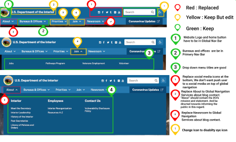
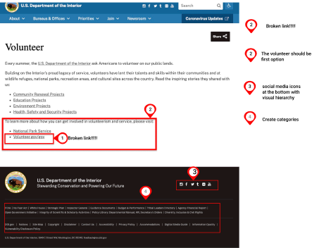
Website Analysis
Website Analysis Website Analysis Website Analysis
Usability Testing
Interviews were conducted with 6 of the survey participants ranged in age from 30- 45. All came from varying backgrounds and shared an interest in giving back to society and nature. The participants were asked to do the following tasks:
- Try to find public lands and information you would need to go there and utilize for a purpose such as camping or recreation.
- Search for Volunteer events for National Parks.
- Understand basic usage/functionality of DOI website. Find something of interest and pursue it as an actionable event.

Common Responses:

“It was easy to finding volunteer link through join but Volunteer.gov was broken.user tried NPS.gov but here her had access to volunteer.gov, the rest was clear and esy for her.”
"User was able to find camping site and information and reservation, but it was not really easy looking for right place and clicking on alot of links."
“Hard to navigate and no information is clear on the website.”
Define

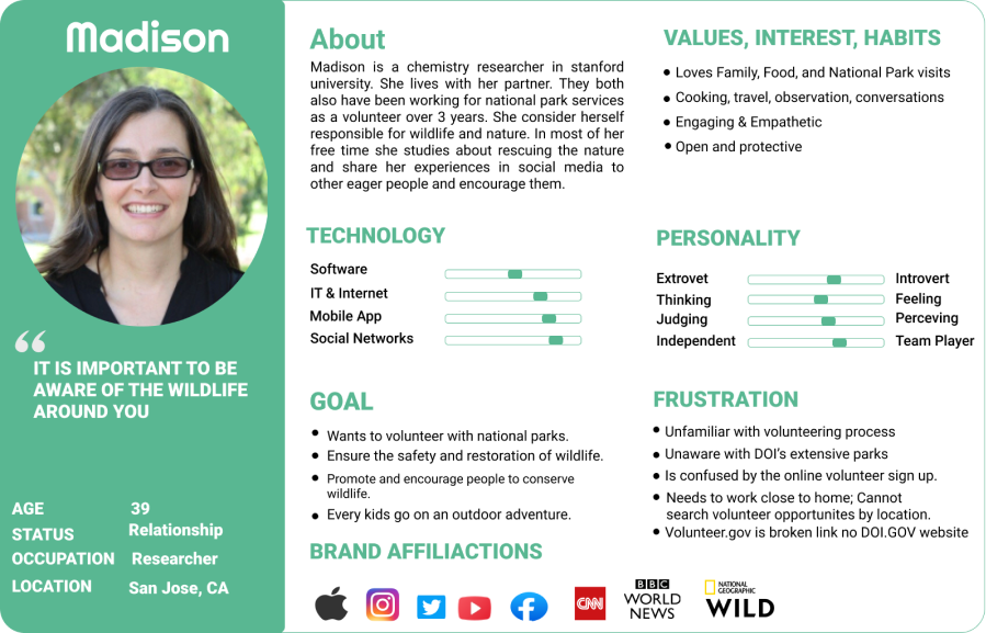
After our research was completed, we came up with a lot of valuable data and we discovered many problems. The next step in our design process is to analyze the data and define the major design problems that should be addressed in our design. Using the data from research, I define the Persona and develop the User Journey and Scenario.

User Persona
userpersona
Develop

According to what Madison wants:

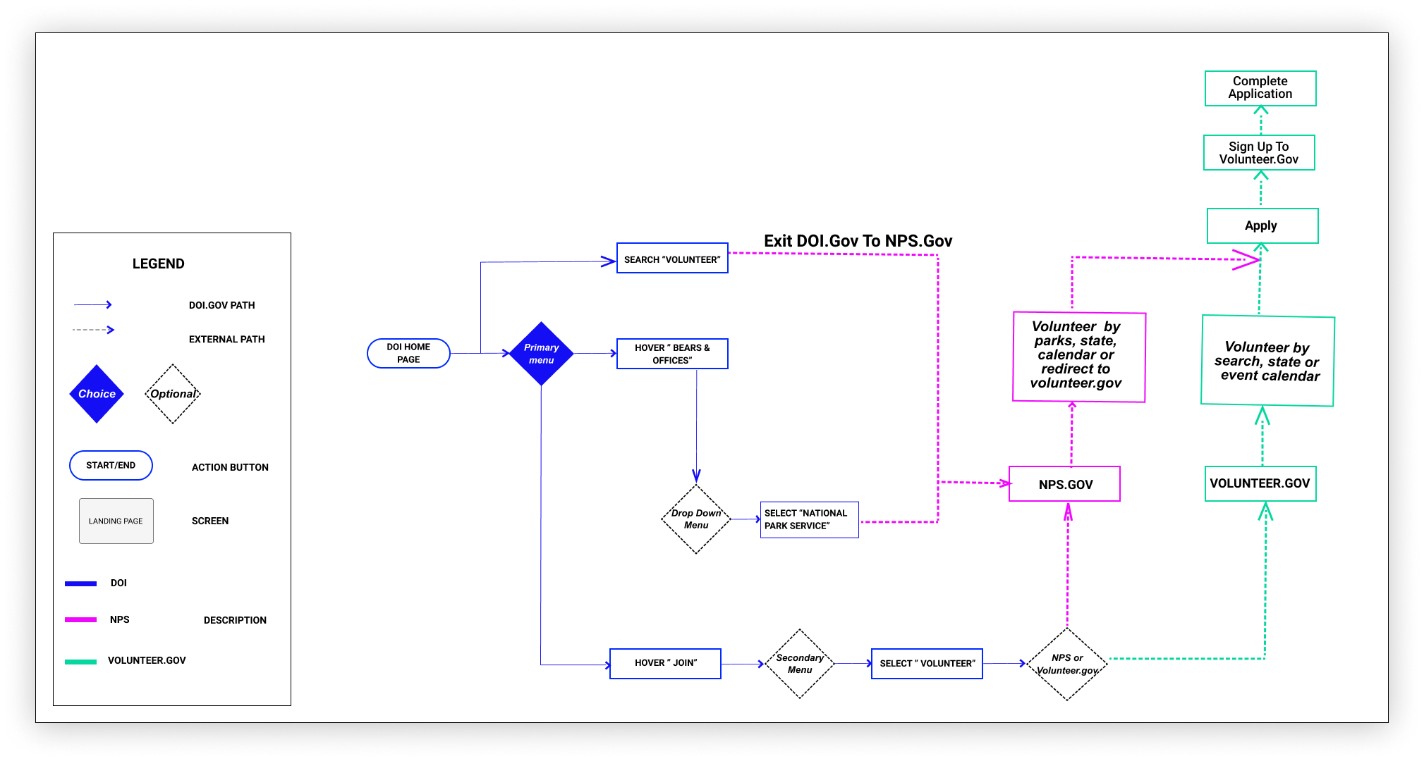
we develope our idea to start our design process. For developing the idea we considered A Scenario to respond to our Persona's needs, and we conducted the user flow to show her journey through browsing the website.

User Problem:

While the site offers information and transparency around how public lands are managed, the site does not offer clear and actionable functionality for people trying to access public lands, resources, and opportunities.

SOLUTION:

Provide a UI that offers clear visible functionality, makes clear the role of governing agencies, and offers more direct access to public lands, resources, and opportunitie
User flow
USER FLOW
Information Architecture

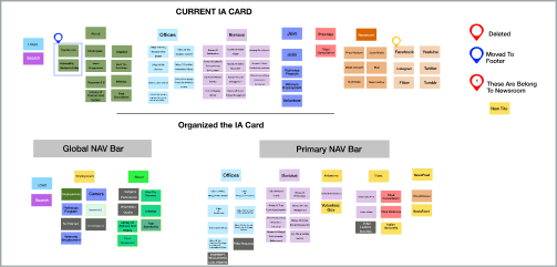
IA Card Sorting:

We conducted both open and closed card sorting to see how our potential users categorize.The navigation bar of DOI.GOV is as follow:
- The navigation bar of DOI.GOV is as follow: In the global section it has the logo of the department which is the home button plus 6 social media active links. In the primary section of the navigation bar, it has 5 main titles and 45 subtitles which you can hover on it.
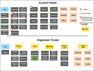
- In the footer section: Again it has the logo of th department or home button. Again 6 links for social media. 25 active links.
Based on the above information, I have done the IA card sorting same as below:
IA Card Sorting IAcard

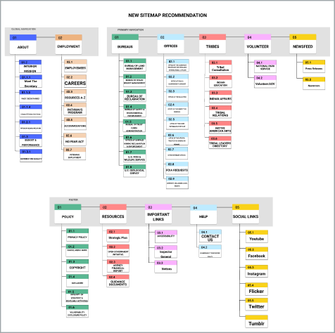
The New Sitemap:

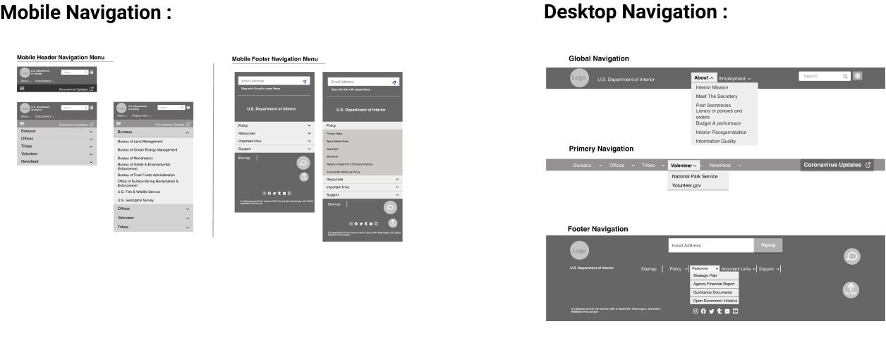
My user’s usability navigation test as well as card sorting resulted in 3 main category of changes in the design of navigation bar and footer listed below:
1- Some new meaningful titles added to simplify the look and bring better structure to the global nav bar and primary nav bar Employment Tribes Volunteer
2- Some titles moved to place in the right category in Footer, global and primary nav bar (Like policies which all listed in one place)
3-Create Categories in the footer
4- Duplicate items removed like contact,...
doi-sitemap
Design

Wireframes, Iterations, and Testing

Navigation Wireframes
Navigation-wireframe
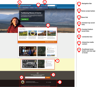
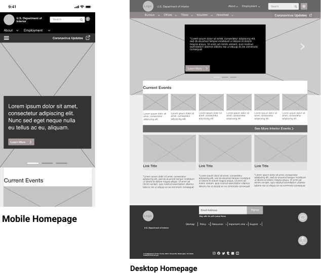
Homepage Wireframes
homepage-wireframe
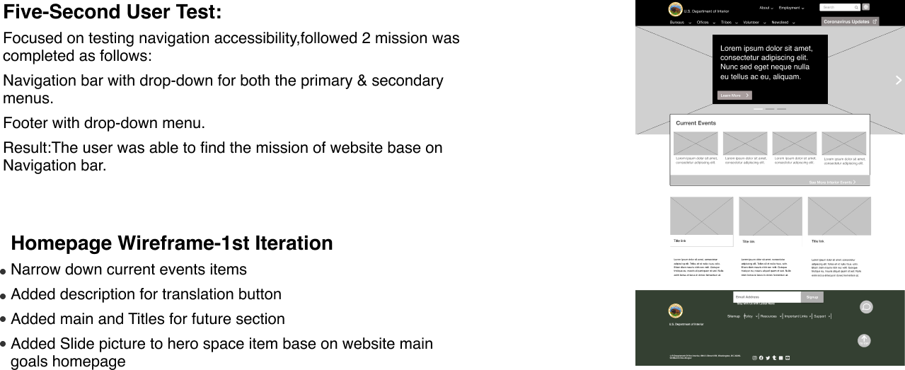
Testing/Iterating
doi-homepage--iterating
Deliver

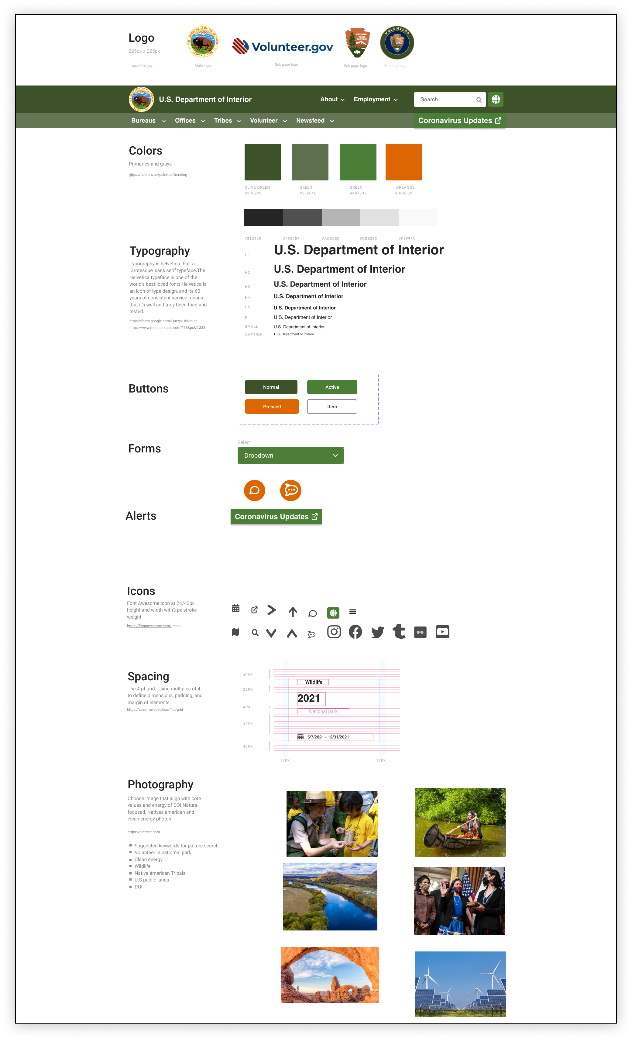
UI Style Tile, Digital Prototype, UI style Guide, Hi-Fi prototype

Style Guide
doi-ui-style
Final Design and Implementation
homepage-wireframe
You can click here to check the Digital interactive prototype.
Project Impact and Reflection
doi-impact