hreo

What is the Pegasus Theatre Chicago’s mission?

The Pegasus Theatre develops and produces boldly imaginative theatre, champions diverse new and authentic voices primarily by and about black, indigenous or other people of color. We promote cultural equity and intersectional, intercultural exchange.

How might we make the site more engaging to attract, and retain talent and patronage for Pegasus Theatre Chicago?

You can click here to check the Digital interactive prototype.
Project Overview
doi-poverview
PTCH-dgoal
UX Process
UX-Process
Discover

We conducted Usability Testing and Comparative/Competitive Analyses, developed the User Journey Map on the existing website, and conducted a comprehensive Online Survey to discover the pain points and develop solutions.

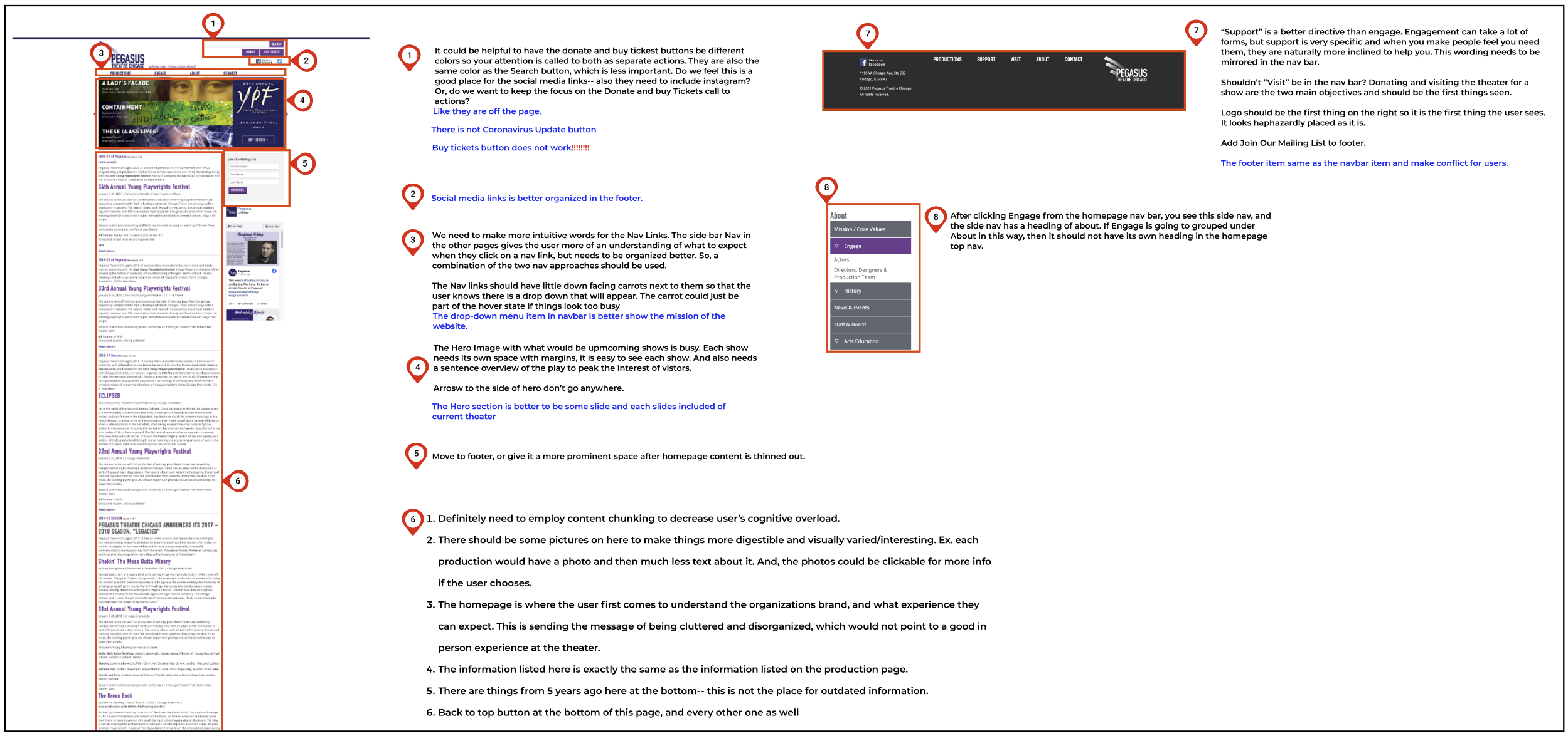
Website Analysis
Website Analysis
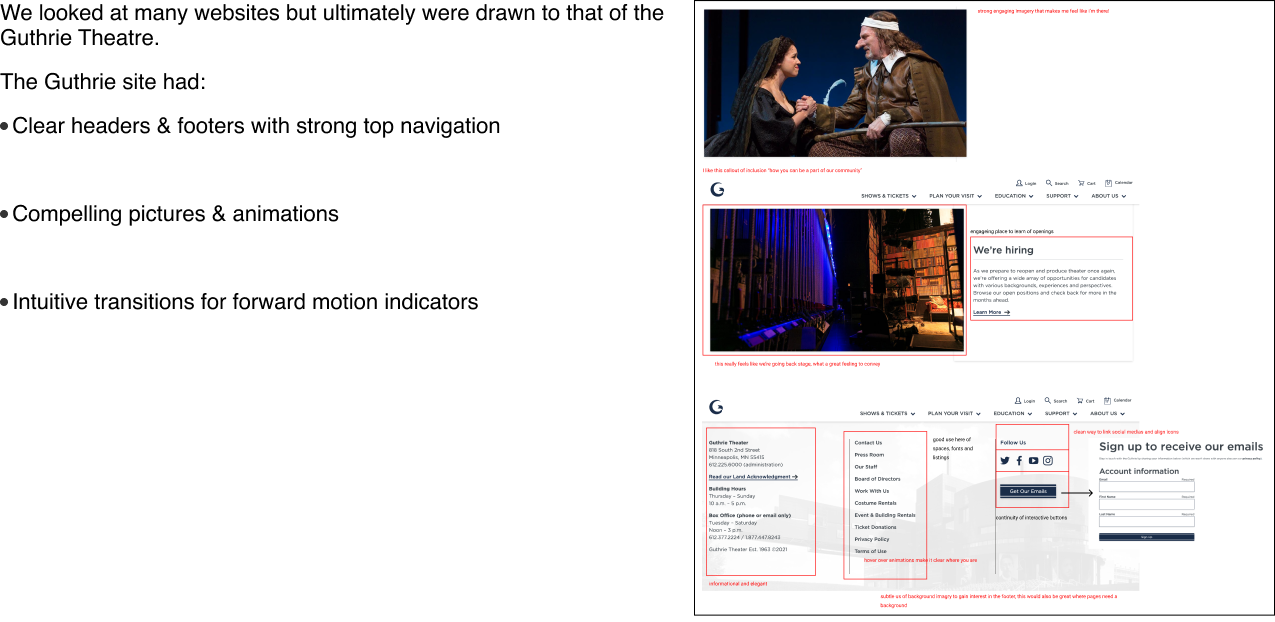
Competitive Analysis
Define

After our research was completed, we came up with a lot of valuable data and we discovered many problems. The next step in our design process is to analyze the data and define the major design problems that should be addressed in our design. Using the data from research, I define the Persona and develop the User Journey and Scenario.

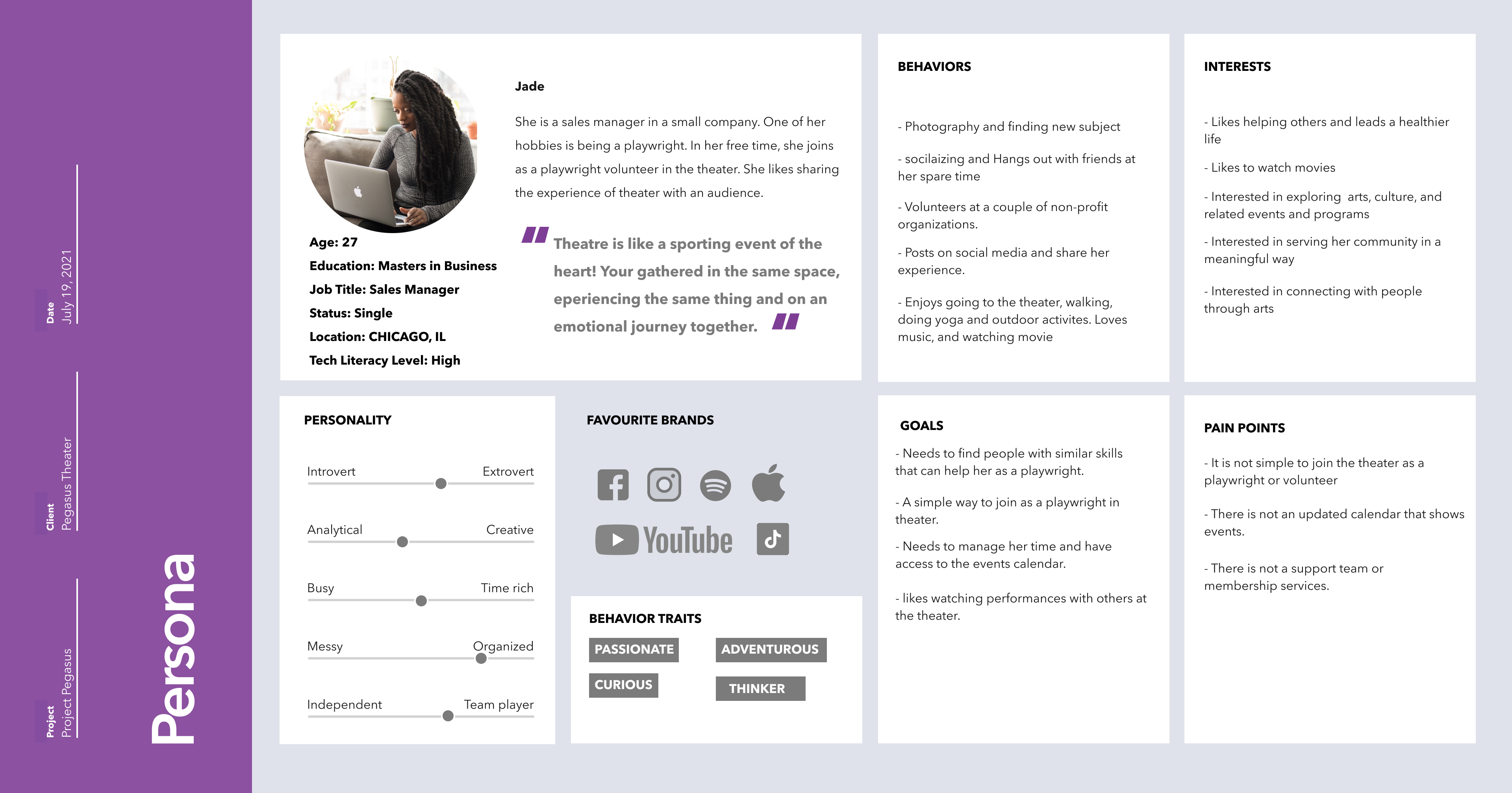
User Persona
userpersona
Develop

According to what Jade wants:

She finds theatre transformative and makes a point to fit it into her life and full schedule, She wants a place where she can be both an audience member and a playwright.

User Problem:

Users visiting the Pegasus Theater site struggle to find up to date, clear, and pertinent information.

SOLUTION:

Our solution will deliver an updated, re-organized and intuitive site so that the theater company can receive more donations, theater goers, and festival applicants.
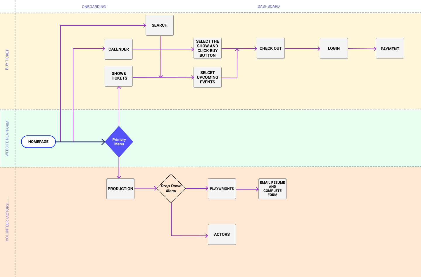
User flow
userflow
Information Architecture

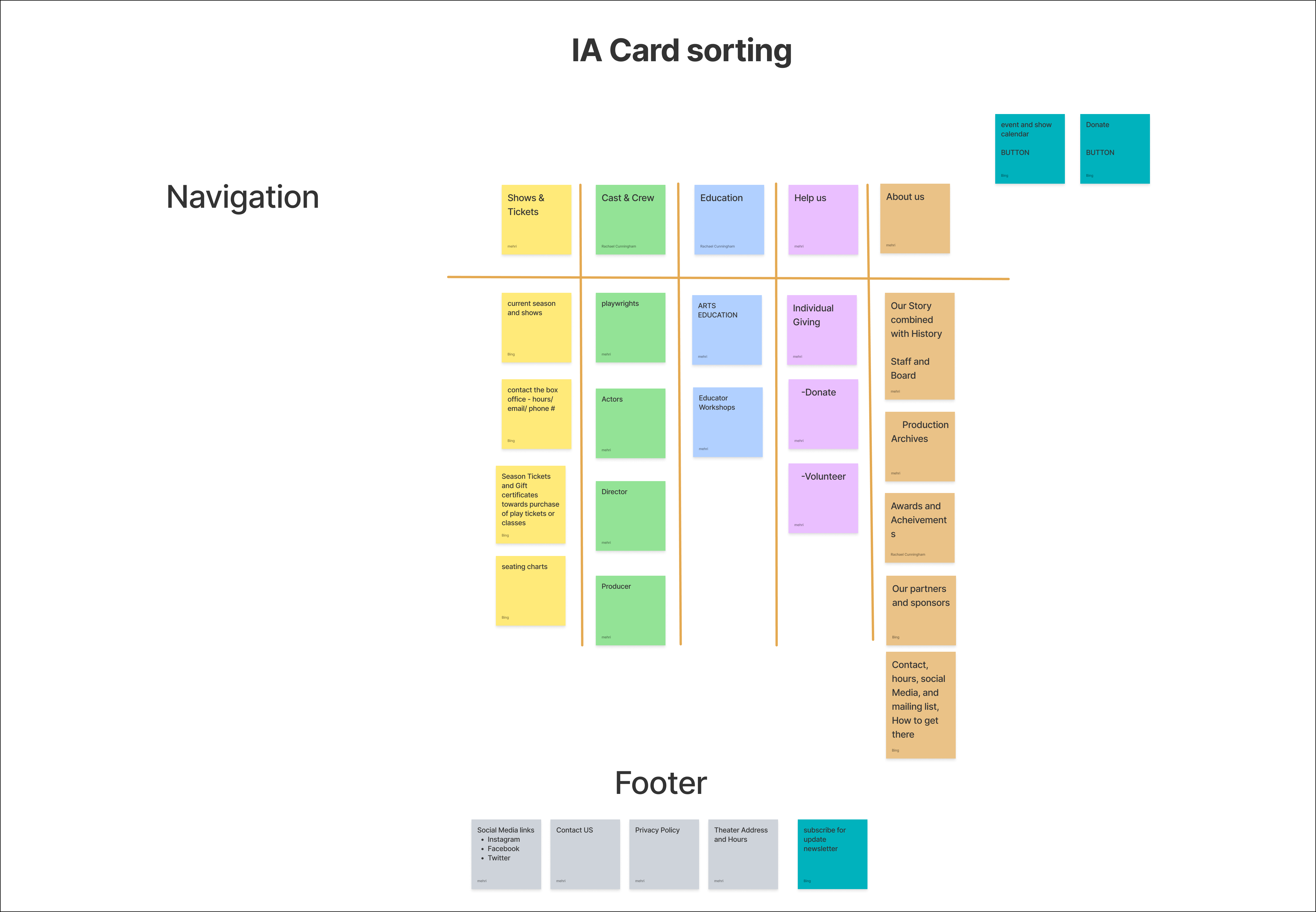
IA Card Sorting:

We conducted both open and closed card sorting to see how our potential users categorize.
- Break down all of the content on the site.
- Doing this helped us to understand what was necessary to keep, and what was misplaced or redundant.
- Putting more focus on donating and participating in productions will be how we solve our problem statement.
IA Card Sorting

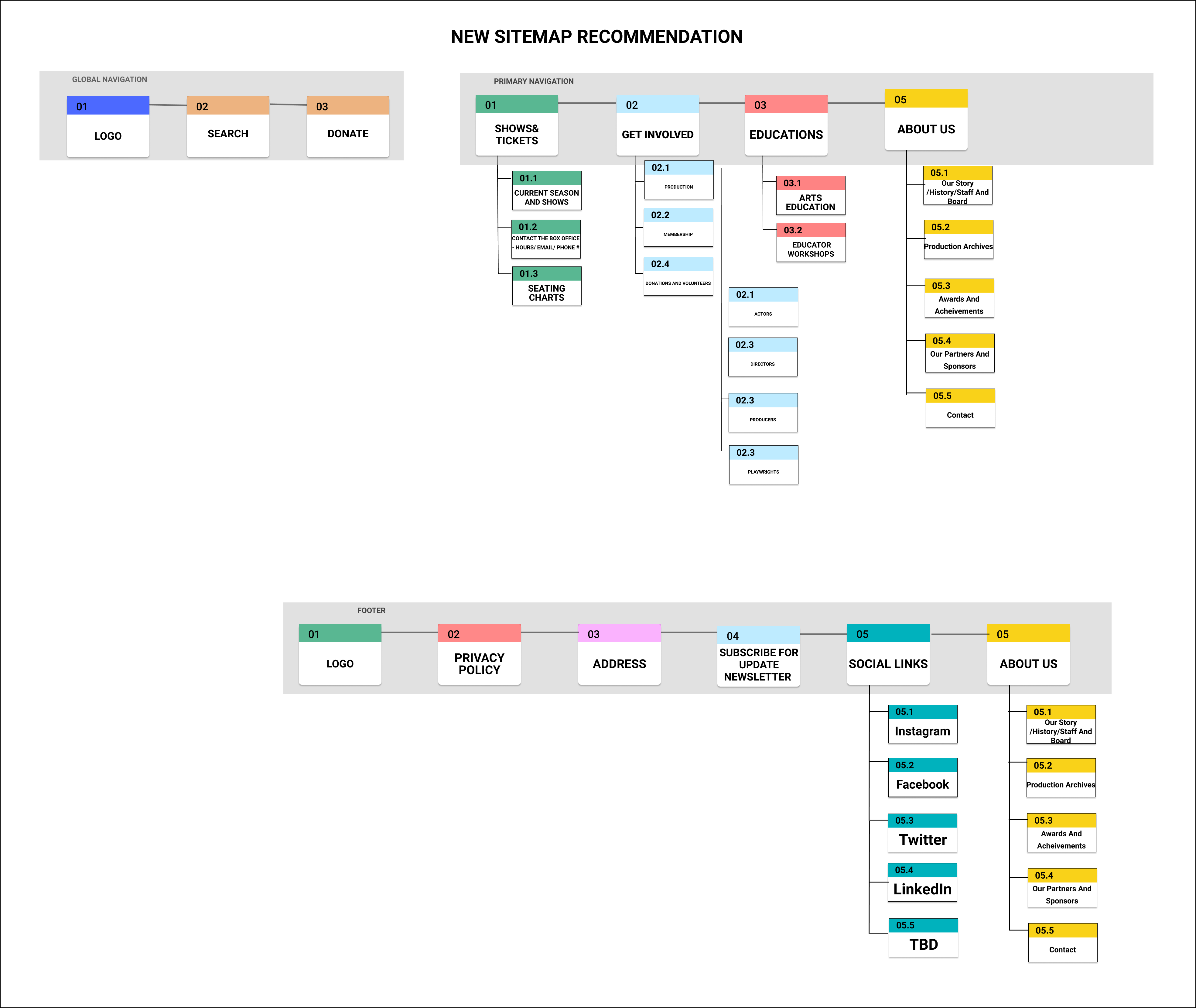
The New Sitemap:

My user’s usability navigation test as well as card sorting resulted in 4 main category of changes in the design of navigation bar and footer listed below:
1- Some new meaningful titles added to simplify the look and bring better structure to the global nav bar.
2- Some titles moved to place in the right category in Footer, global and primary nav bar (Social links).
3-Added social links and subcribe box in the footer.
4- Duplicate items removed.
ptch-sitemap
Design

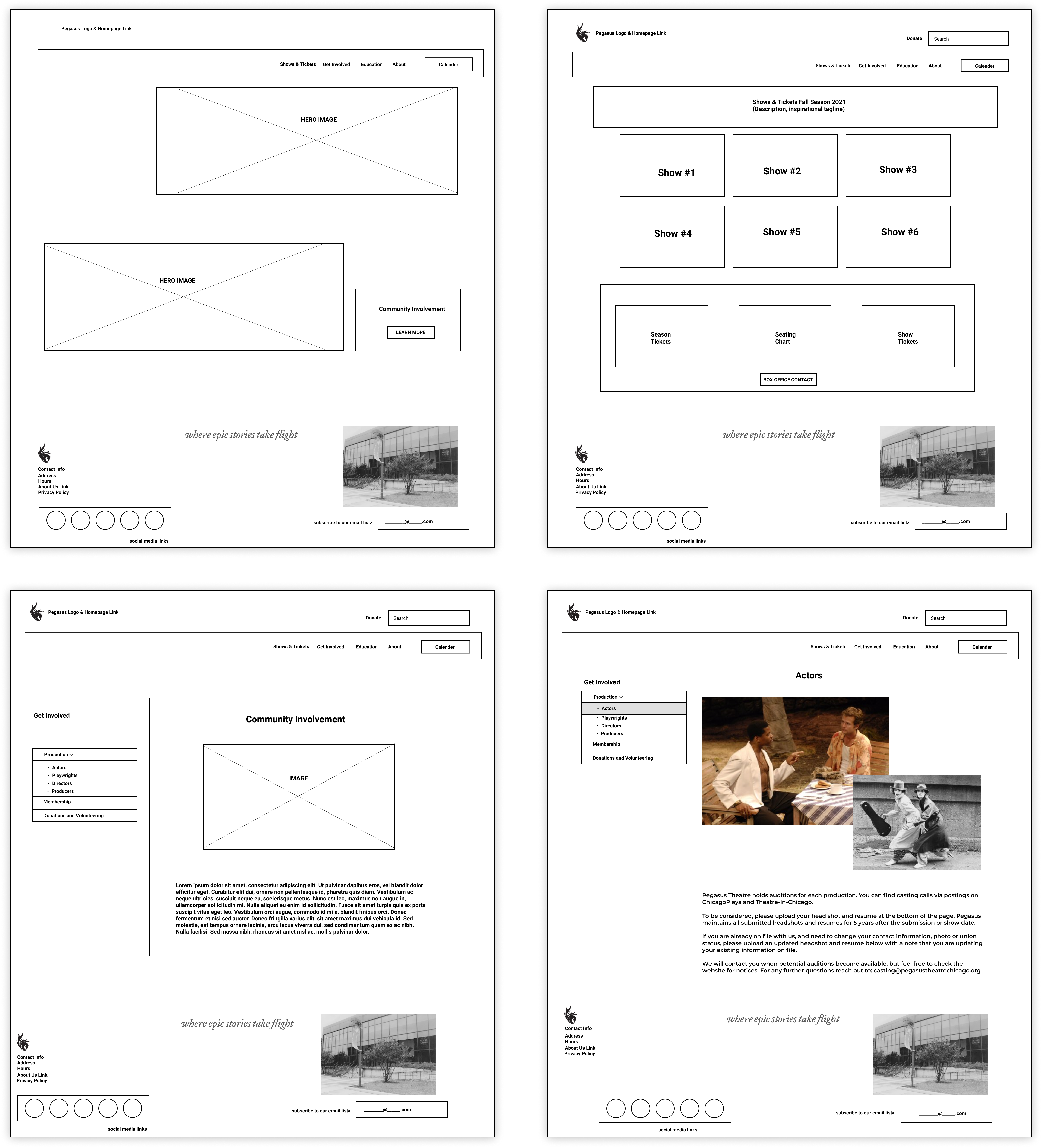
Wireframes, Iterations, and Testing

Homepage Wireframes
homepage-wireframe
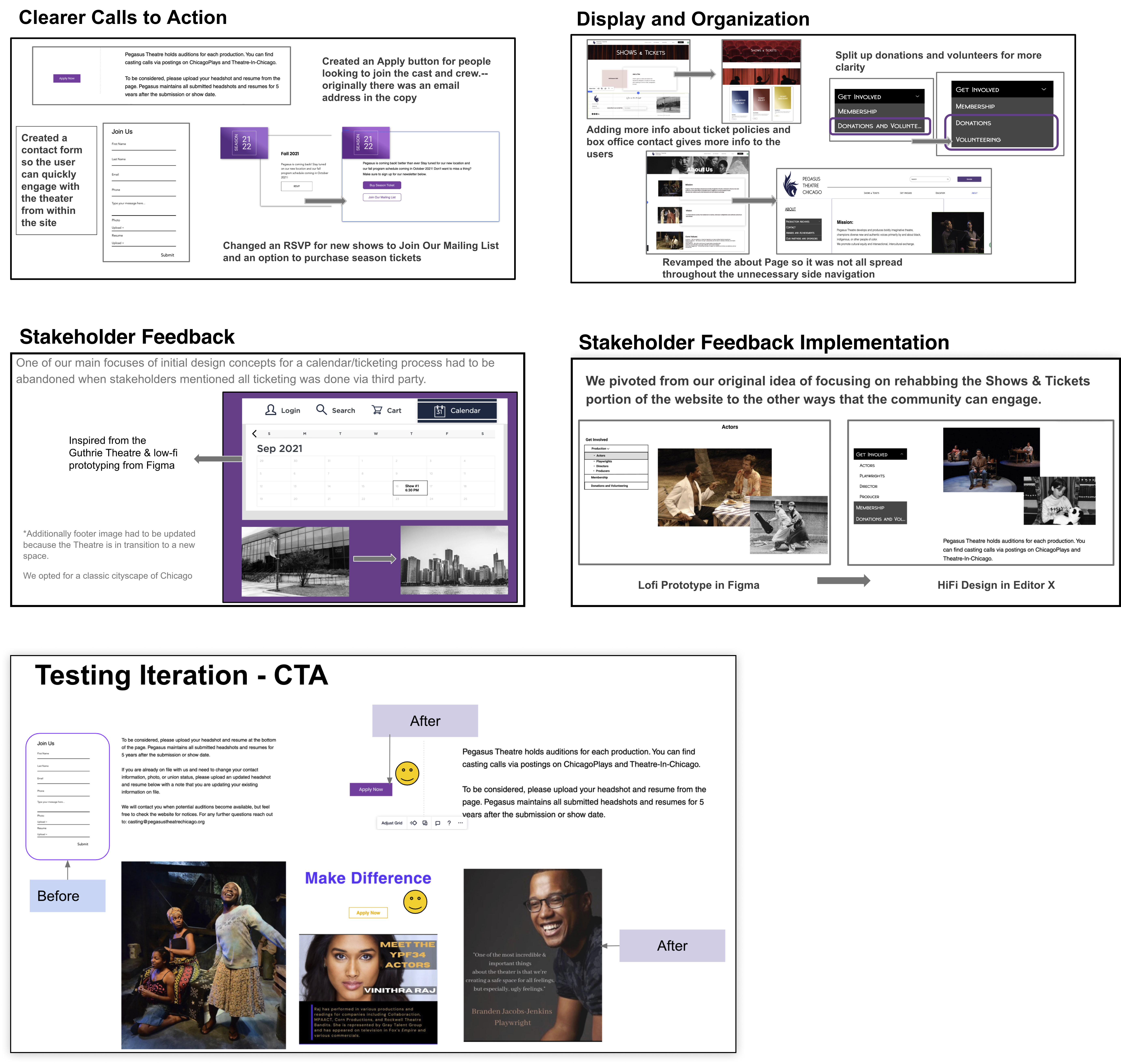
Testing/Iterating

Testing Plan:

Conducted user testing to learn:
1- If the site was now easy to understand and navigate through.
2-The users’ first-impression is on the overall design and color harmony.
3-The clear brand image of the Non-profit organization.
4-The stakeholder's opinion of our work so far good and needs improvement.
Teting
Deliver

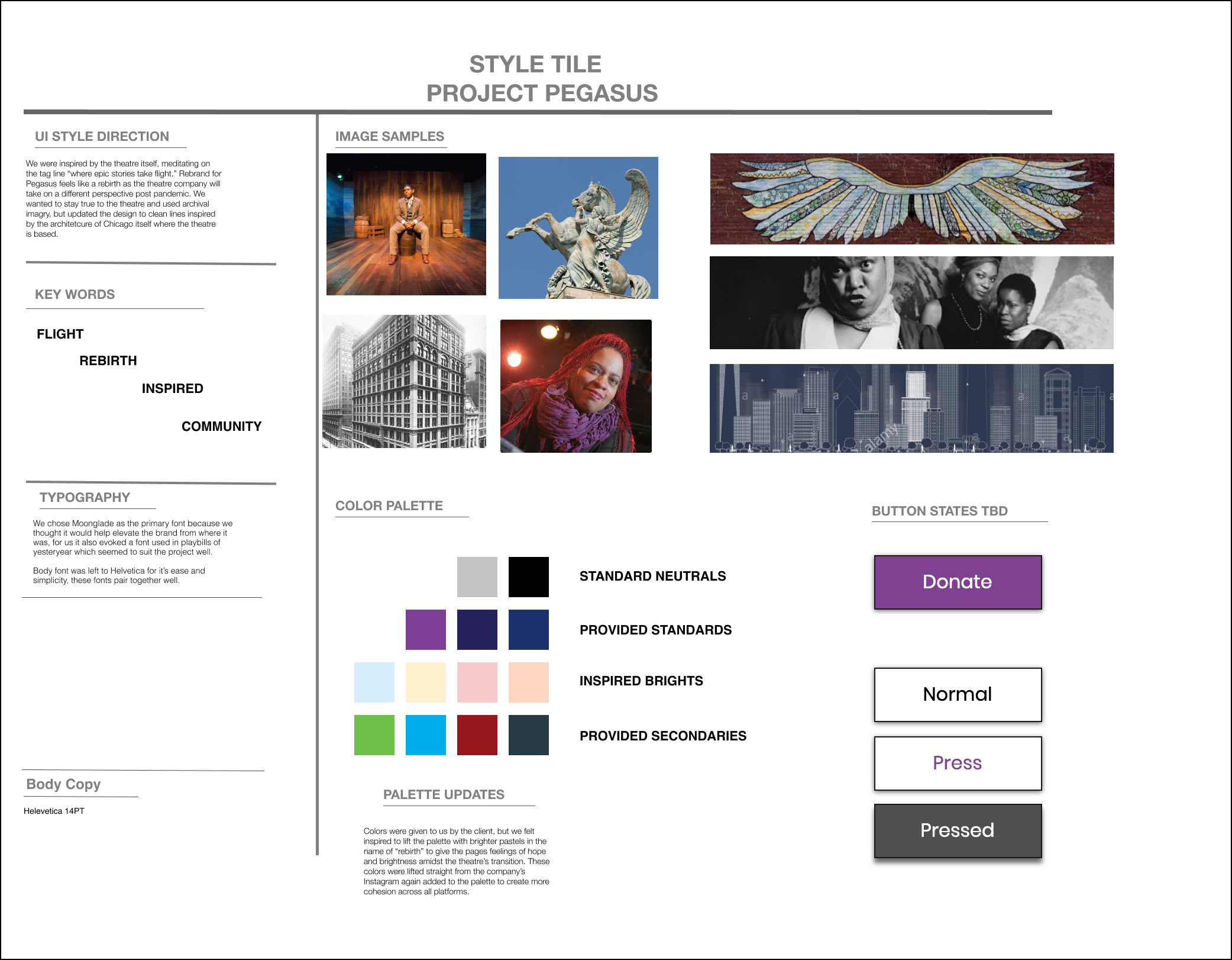
UI Style Tile, Digital Prototype, UI style Guide, Hi-Fi prototype

Style Guide
style tile
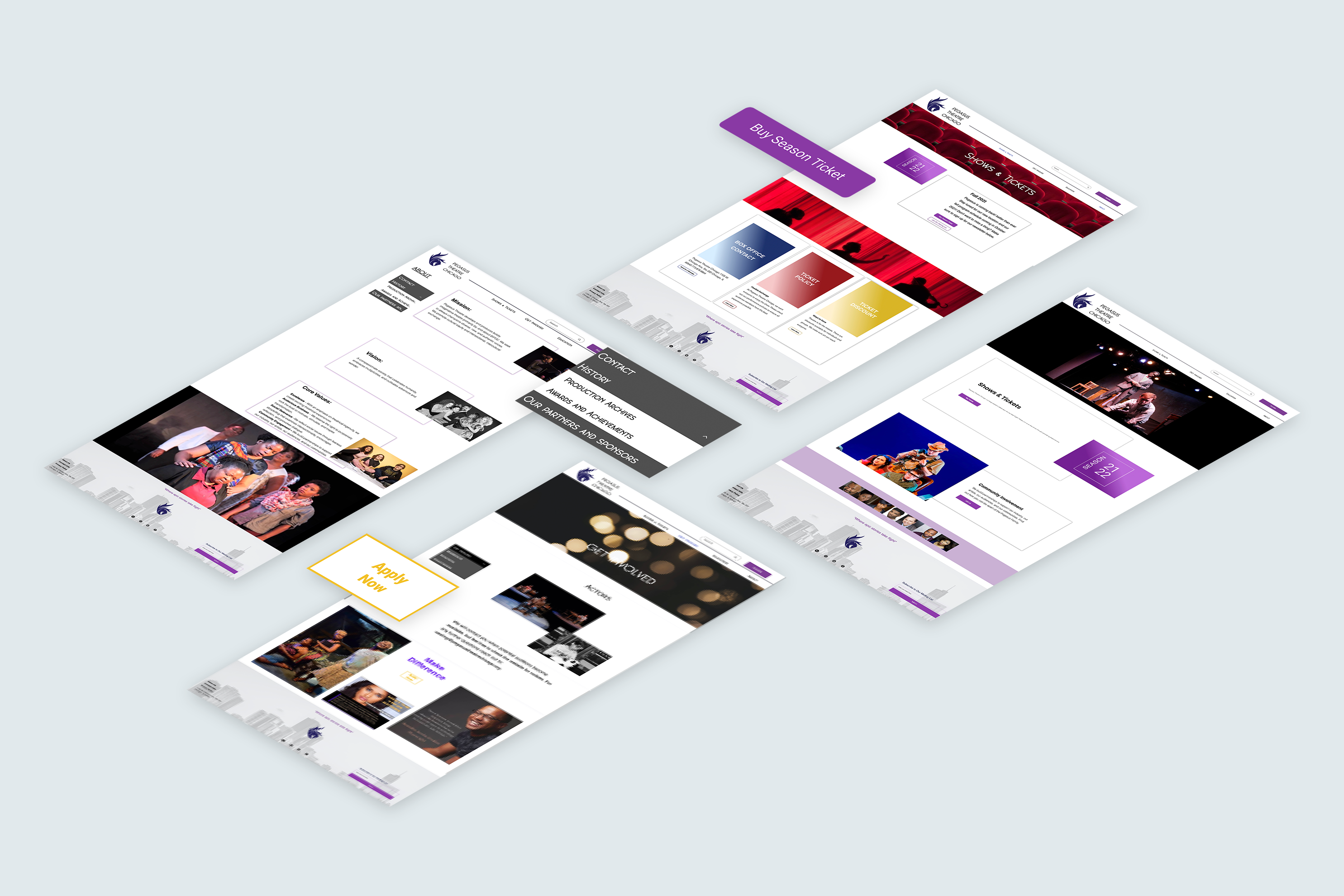
Final Design and Implementation
homepage-wireframe
You can click here to check the Digital interactive prototype.
Project Impact and Reflection
doi-impact